Why Designers Are Turning To Earth Tones For Timeless Luxury
From warm travertine and clay to olive greens and rich walnut, discover why earth toned interiors are replacing stark minimalism as the defining expression of modern luxury
Luxury has an odd habit of chasing fashion. One decade everything had to be polished white marble, chrome and enough glass to make a greenhouse jealous. The next, every billionaire suddenly wanted concrete walls that looked as though nobody had quite finished building the house. Interior design, much like the fashion industry, occasionally mistakes novelty for sophistication.
But then something rather sensible happened. Designers stopped asking what colour looked expensive and started asking what colour actually made people want to stay in a room. The answer was never electric blue, mirror finished black or neon orange. It was the colour of the earth itself. Clay. Sand. Limestone. Olive. Walnut. Terracotta. Moss. Colours that have existed for millions of years without once worrying about trends on social media. Today’s finest homes are no longer shouting for attention. They are whispering with remarkable confidence, proving that true luxury isn’t painted gold. More often than not, it looks suspiciously like nature.
Luxury Is Becoming Softer, Not Louder
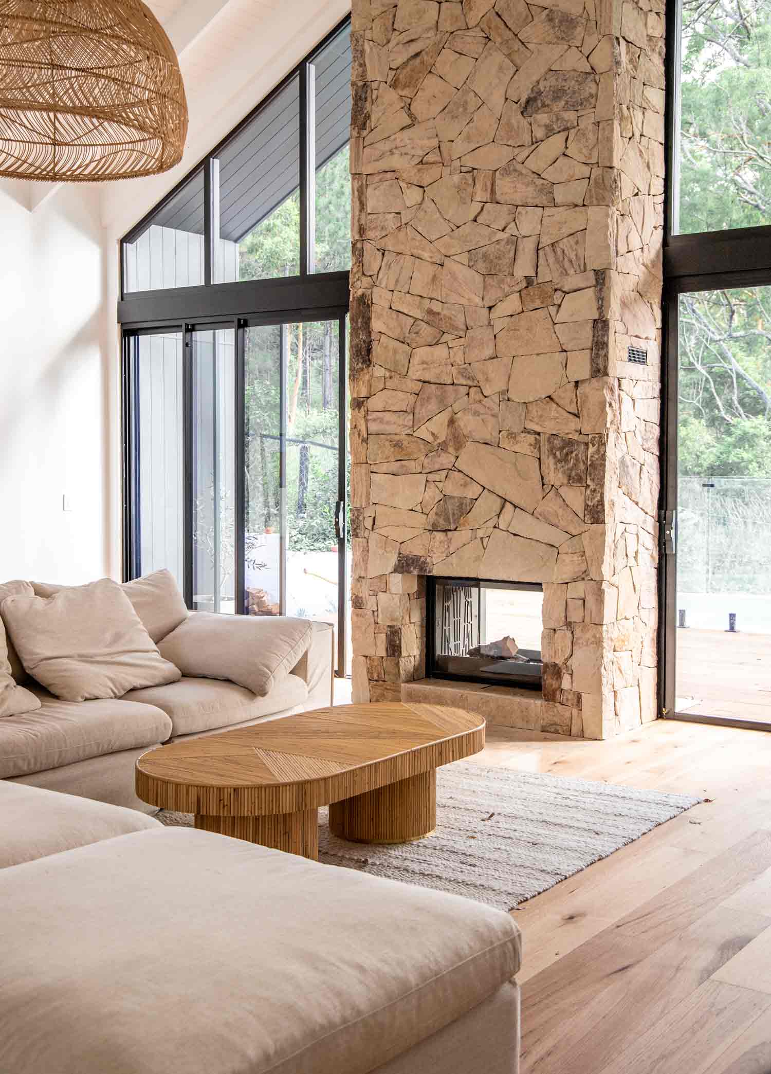
The definition of luxury has shifted dramatically over the past decade. Rather than relying on visual excess or highly polished finishes, contemporary interiors increasingly prioritise comfort, longevity and emotional warmth. Earth tones naturally support this philosophy. Warm neutrals, muted browns, soft ochres and subtle greens create spaces that feel welcoming rather than overwhelming. Instead of dominating a room, these colours quietly establish an atmosphere that becomes more inviting the longer one inhabits it. The result is an understated elegance that feels immune to changing trends.
Also Read: Elevated Living: The Psychology of Double Height Spaces In Luxury Homes
Nature Has Always Been The Greatest Designer
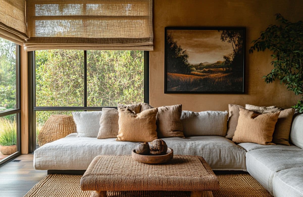
Earth toned interiors succeed because they borrow directly from landscapes that humans have instinctively connected with for centuries. The warm hues of desert sand, weathered stone, forest bark, fertile soil and Mediterranean clay possess an inherent familiarity that manufactured colour palettes rarely achieve. These tones create a subconscious sense of calm because they mirror environments that people naturally associate with balance, stability and comfort. It is biophilic design at its most effortless.
Natural Materials Come Alive
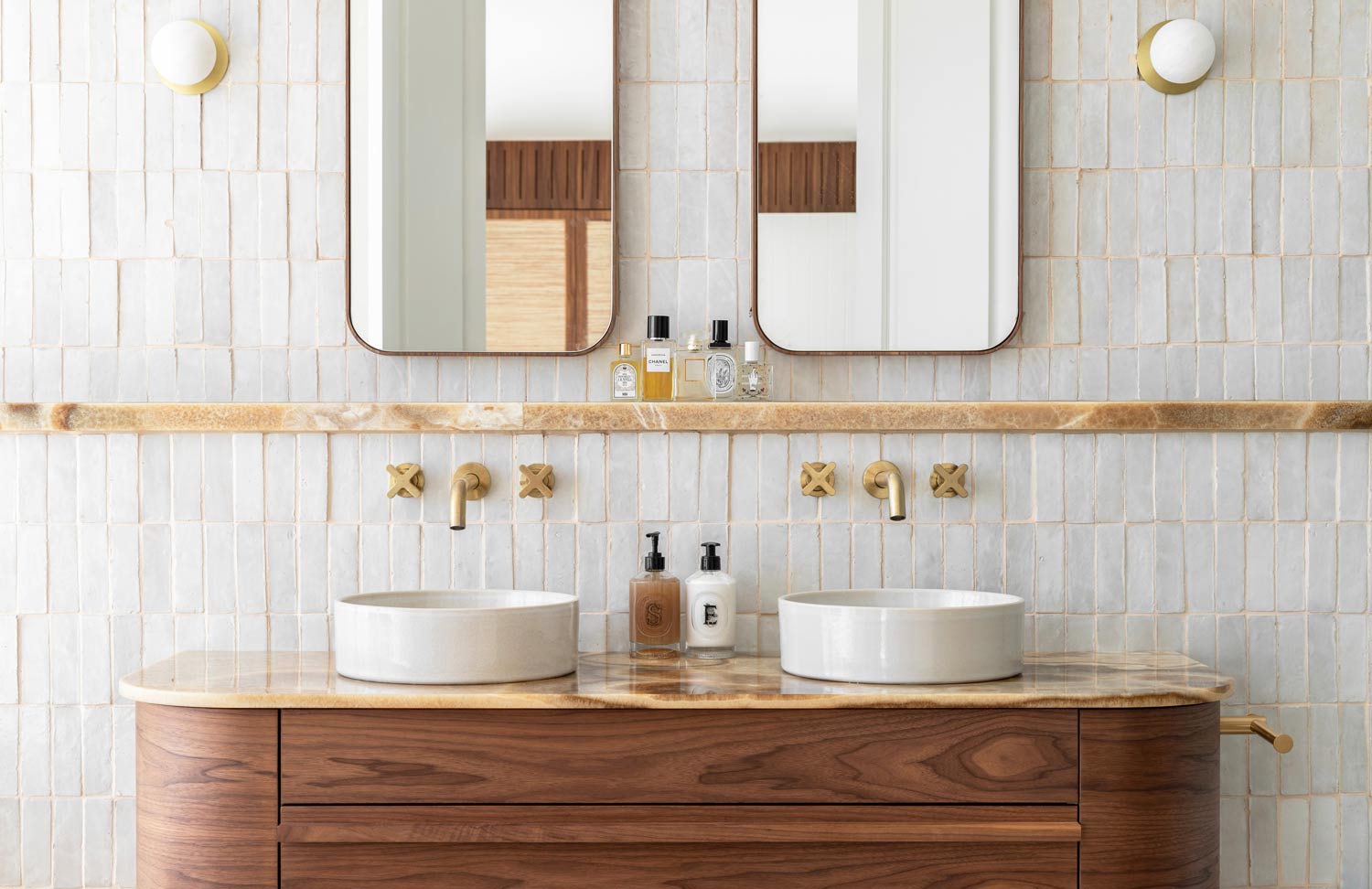
Earth tones allow materials to become the true protagonists of an interior. Travertine reveals its layered textures more beautifully against soft beige surroundings. Walnut timber gains greater richness alongside muted olive walls. Limestone, terracotta, clay plaster, linen and natural wool all develop remarkable depth when surrounded by colours that complement rather than compete with their organic character. Rather than masking imperfections, earth toned palettes celebrate them, allowing craftsmanship and material authenticity to take centre stage. They Age Gracefully, one of the greatest strengths of earth toned interiors is their remarkable longevity.
Unlike fashionable colours that quickly reveal the era in which they were chosen, natural palettes remain relevant across generations. Warm taupes, terracotta, olive greens and soft browns rarely appear dated because they are rooted in the natural world rather than seasonal design movements. Much like fine leather or aged timber, these colours often become even more beautiful with time.
Light Does The Decorating
Earth toned interiors possess an almost magical relationship with natural light. Morning sunlight introduces warm golden reflections across clay walls, while afternoon light deepens the richness of walnut, bronze and stone. As daylight shifts throughout the day, these colours constantly evolve, giving interiors an ever changing sense of depth and atmosphere without requiring elaborate decoration. The architecture itself becomes more expressive simply through the movement of sunlight.
They Create Emotional Luxury
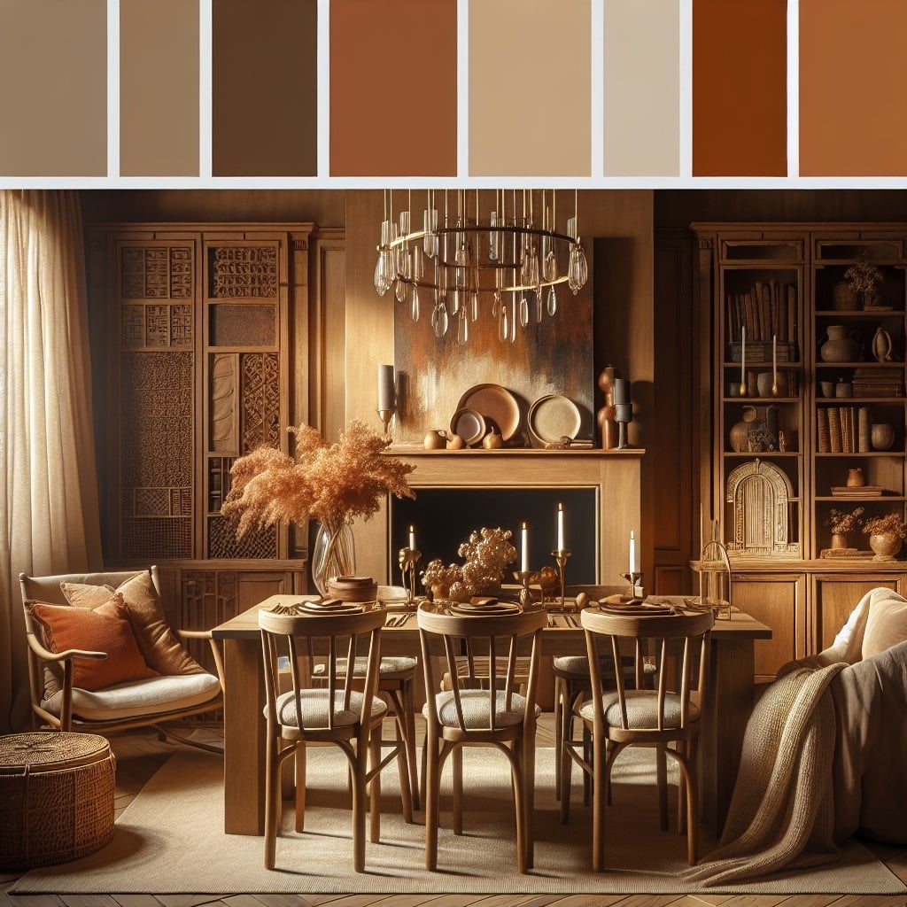
Perhaps the greatest luxury today is not visual extravagance but emotional wellbeing. Earth toned interiors reduce visual noise, soften spatial transitions and encourage slower living. Bedrooms become more restful, living rooms feel more conversational and workspaces become calmer environments for concentration. In an increasingly overstimulated world, colours inspired by nature provide something money alone cannot buy, a genuine sense of peace.
Earth Tones Work Across Every Design Style
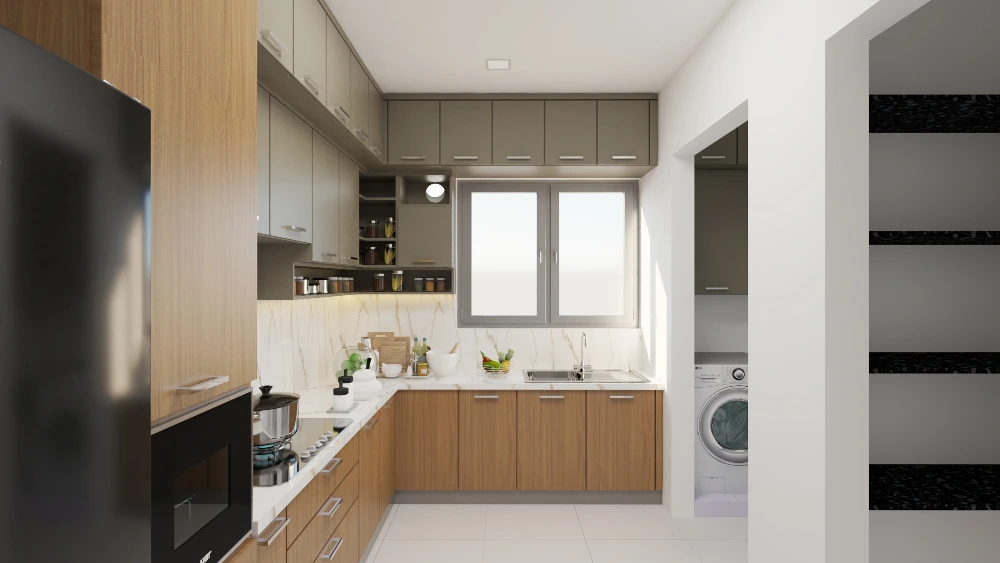
Unlike many colour trends that belong to a specific movement, earth tones possess extraordinary versatility. They complement Mediterranean villas, Scandinavian minimalism, Japanese inspired interiors, contemporary penthouses, heritage residences and modern farmhouses with equal confidence. Whether paired with handcrafted timber, exposed concrete, brushed brass or natural stone, these colours provide a cohesive foundation that allows architecture itself to shine. That flexibility explains why they continue to dominate the world’s finest residential projects.
There is something wonderfully reassuring about a colour palette that has absolutely no interest in impressing anyone. Earth tones don’t scream for attention, they simply grow more beautiful every time you look at them. They understand a lesson many luxury brands are only now beginning to learn, that permanence will always outlast spectacle.