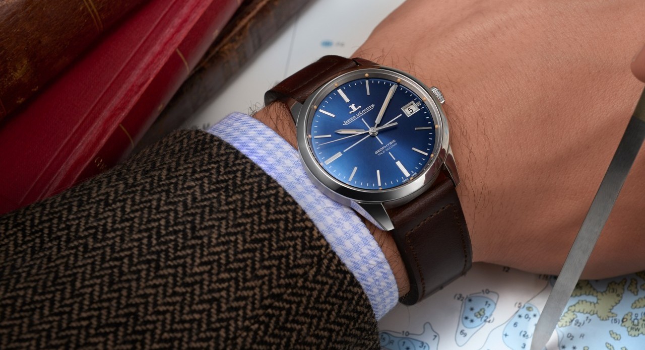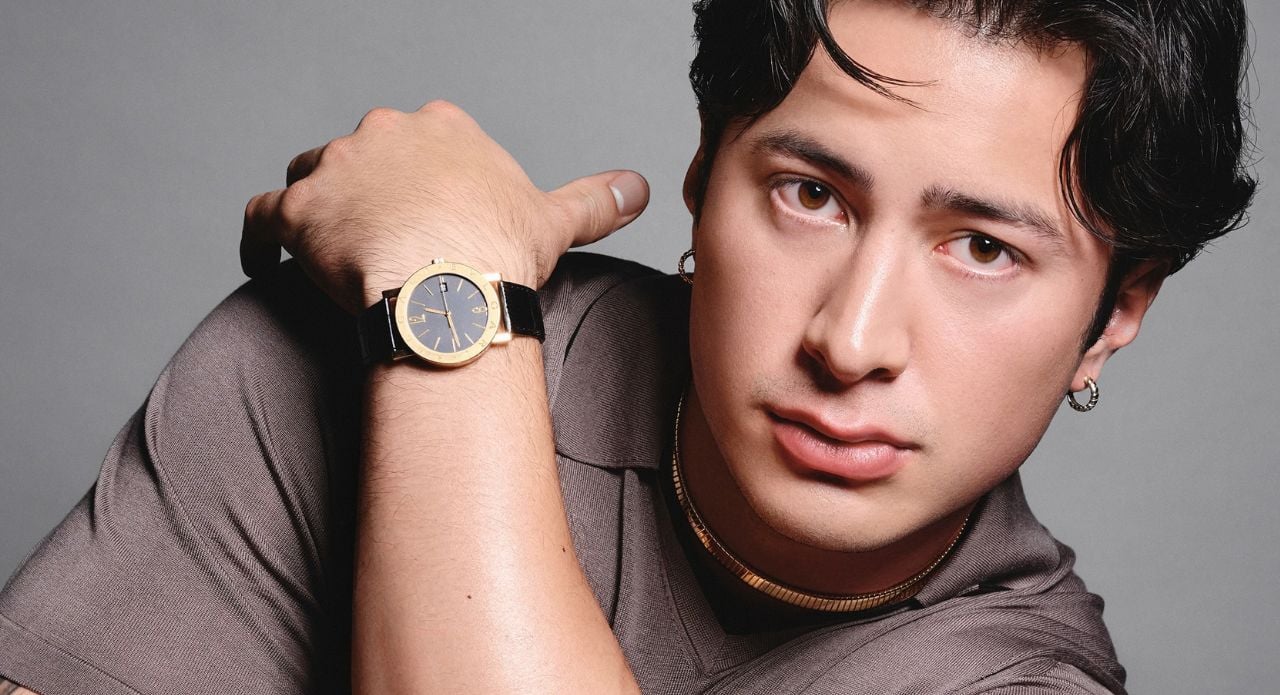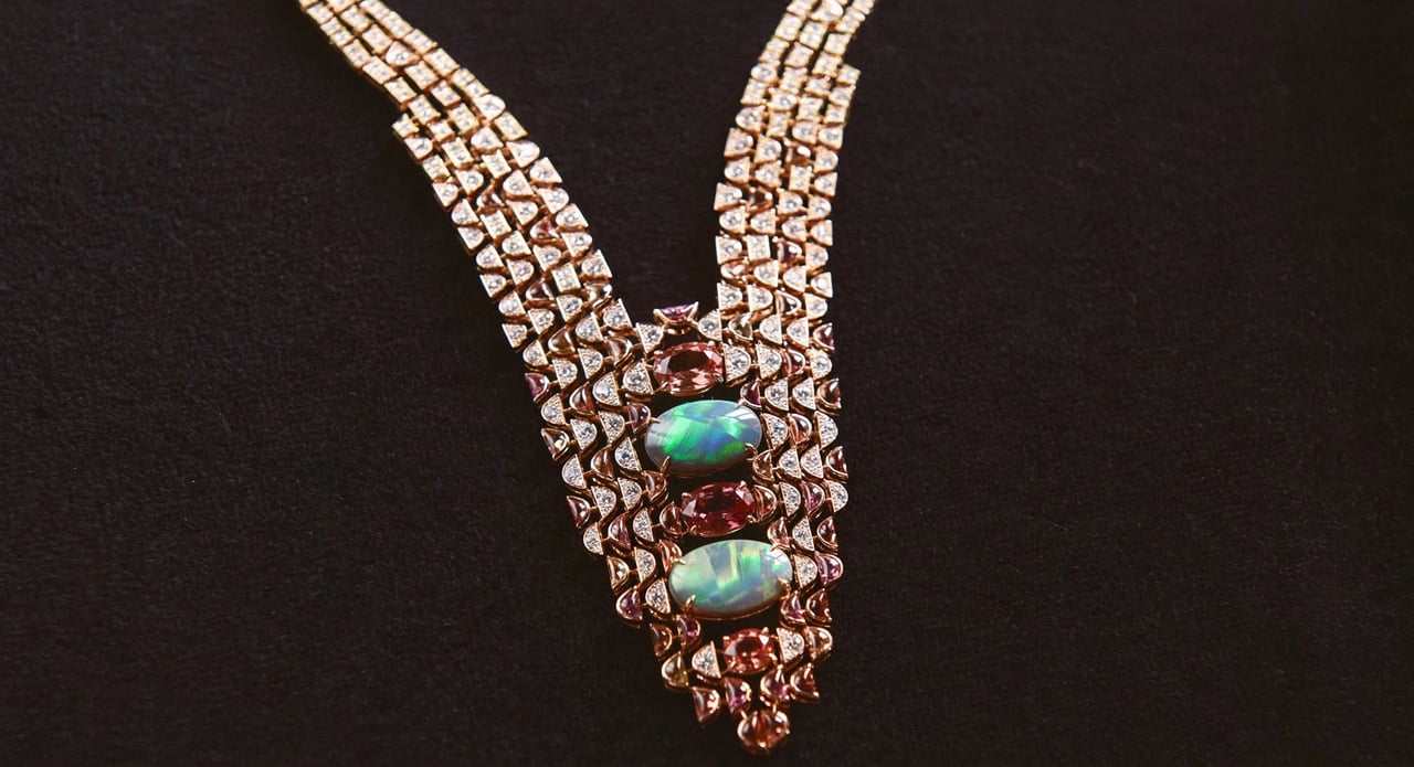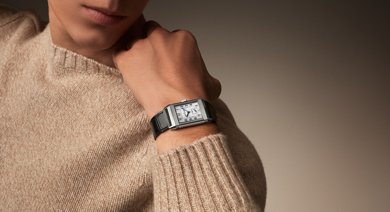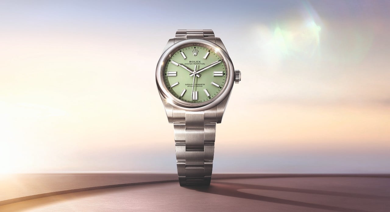


There is a particular delight in watching an industry as famously conservative as Swiss watchmaking suddenly discover its inner pastel self, rather in the manner of a stern headmaster unexpectedly turning up to the school fête in a lavender cravat. One scarcely expects the custodians of centuries-old horological gravitas, the houses that once debated the correct number of beats per hour with the solemnity of a papal conclave, to start producing dials the colour of a particularly good macaron. And yet, here we are, in 2026, with Rolex, Audemars Piguet and TAG Heuer all reaching, quite deliberately, for shades of pink, blue, green and lavender. The question worth pondering is not merely whether this looks good, which it generally does, but what it reveals about an industry that has spent the better part of this century insisting its innovations live chiefly inside the movement rather than upon the dial.
Colour as the New Complication
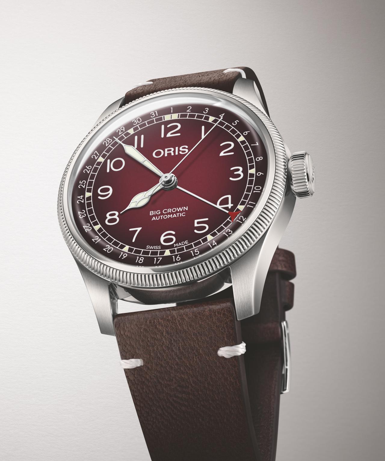
Here lies the real cleverness of the moment. For decades, the watch industry’s preferred method of reinvention has been mechanical: a new movement, an additional function, a previously unseen complication tucked beneath the dial. Pastel dials represent a different, rather more democratic approach, one that requires no new patent and no additional engineering, yet achieves something remarkably similar in effect. Dip a beloved, recognisable reference into a wash of mint green or dusty lavender, and suddenly a watch that has existed in collective memory for decades looks like something you have never seen before, while remaining, structurally, exactly what it always was. It is sleight of hand of the finest order, changing everything about how a watch is perceived while changing almost nothing about how it actually works.
Also Read: Glashütte: The Historic Home Of German Watchmaking
Attracting a New Generation
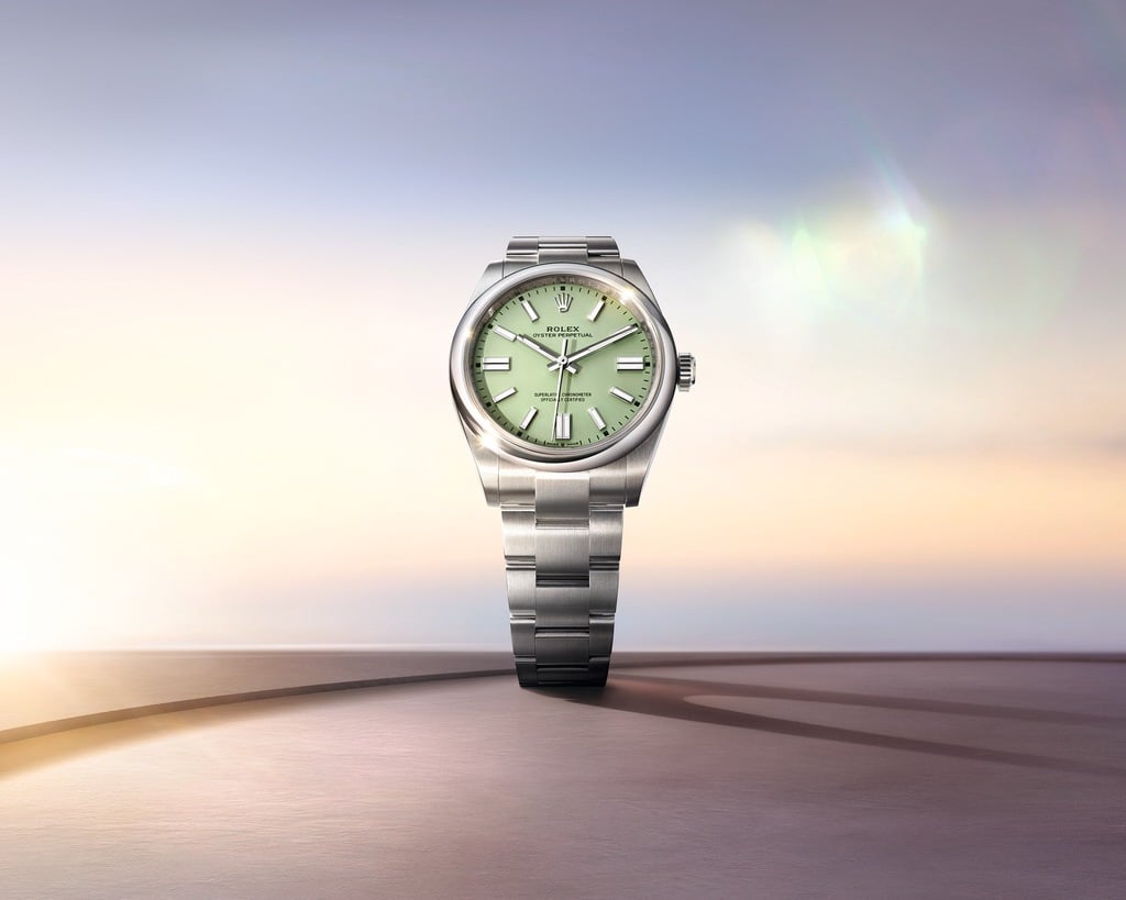
There is also a rather shrewd commercial logic humming beneath all this chromatic experimentation. Luxury watchmaking has spent recent years wrestling with a genuine demographic puzzle: how does an industry built on heritage and tradition court younger, newer collectors without alienating the connoisseurs who have spent decades memorising reference numbers and production years? Pastel dials offer a rather elegant answer. They soften a watch’s presence just enough to feel fresh and approachable to someone encountering the silhouette for the first time, while leaving the underlying design language, the proportions, the case architecture, the brand’s essential grammar, entirely intact for the traditionalists who would baulk at anything more drastic. It is reinvention calibrated with considerable precision, which is, when you think about it, rather appropriate for an industry built on precision in the first place.
Also Read: Inside Baume & Mercier’s India Strategy: Michael Guenoun On Talent, Authenticity And Partnerships
How Pastel Dials Are Actually Made
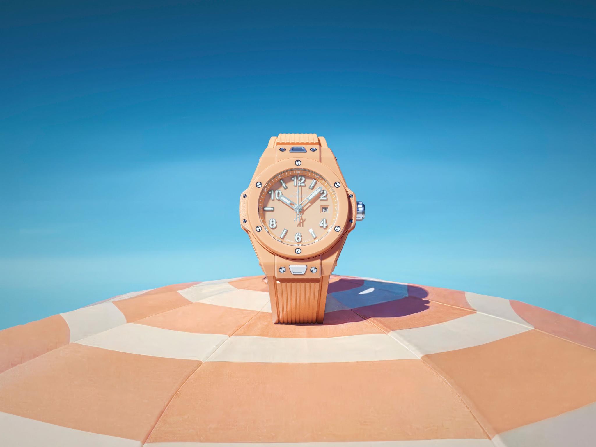
The most common method involves galvanic treatment, where a base metal dial, typically brass or silver, is electroplated with a thin layer of colour, a process that allows for remarkably precise, consistent tones but requires exceptional control, since pastel shades are unforgiving of any inconsistency in the plating bath. Sunray or sunburst finishing often follows, where the dial’s surface is brushed in a radial pattern before colouring, so that light catches the pastel tone differently depending on the angle, giving even a flat colour a subtle sense of movement and depth rather than appearing dull or static.
Lacquering offers an alternative route, particularly favoured for achieving the softer, slightly translucent quality that defines the best pastel dials. Here, a base colour, often a muted grey or warm gold tone, is built up with several thin layers of coloured lacquer, each one polished before the next is applied, a laborious process that creates genuine depth and a faint luminosity rather than a flat, one-dimensional wash of colour. Some manufactures take this further still with hand-guilloché work beneath the lacquer, engraving fine geometric or wave-like patterns into the dial’s surface before colouring, so the pastel tone settles unevenly into the engraved grooves and catches light in ways a smooth dial simply cannot replicate.