Why Plate Colour Matters: How Food Colour Shapes What We See, Taste, And Choose
From white porcelain to inky black ceramics, the colour beneath your food quietly rewires how your brain tastes before your mouth ever gets involved
We like to believe we’re sophisticated diners, guided by refined palates and discerning taste buds, but the truth is far less flattering. Before you’ve lifted a fork, before the aroma even gets a chance to flirt with your nose, your eyes have already made a decision. And sitting right there, minding its own business yet pulling all the strings, is the plate. Change the colour of what your food sits on and suddenly that dessert feels sweeter, that salad looks fresher and that steak seems more expensive. It’s culinary psychology at its most mischievous. The plate doesn’t just hold food — it lies to you politely, and you happily believe every word.
The Science Behind Colour And Taste Perception
Our brains are hardwired to associate colour with flavour intensity, freshness and even safety. Studies in food psychology show that colour contrast between plate and food affects how strong we perceive taste to be. High contrast makes flavours appear bolder, while low contrast can dull them. A strawberry dessert on a white plate often tastes sweeter than the same dish on a dark one, even when nothing about the recipe changes. This is because visual cues prime the brain, setting expectations that the palate obediently follows.
Also Read: Fragile To Formidable: The Use Of Porcelain Dials In High-End Watchmaking
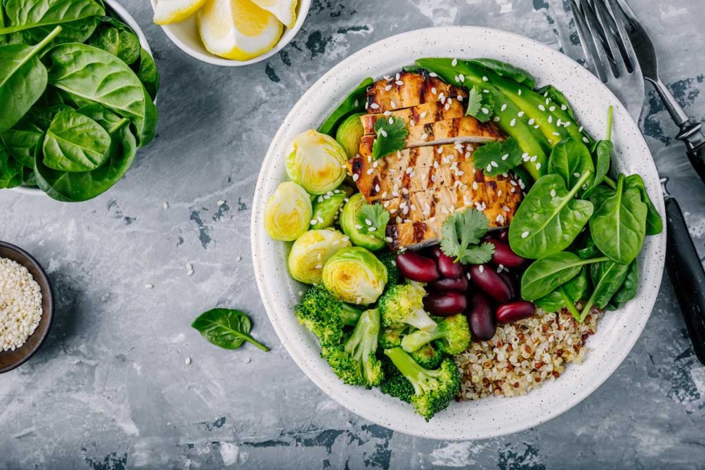
Why White Plates Became The Default
White plates dominate dining tables and restaurants for a reason. They provide a neutral backdrop that enhances colour contrast, making food appear more vibrant and intentional. White suggests cleanliness, precision and control — qualities chefs want associated with their cooking. It also allows the ingredients to speak without interference, turning the plate into an invisible stage. This neutrality, however, is not passive; it subtly elevates perception of quality, especially in fine dining.
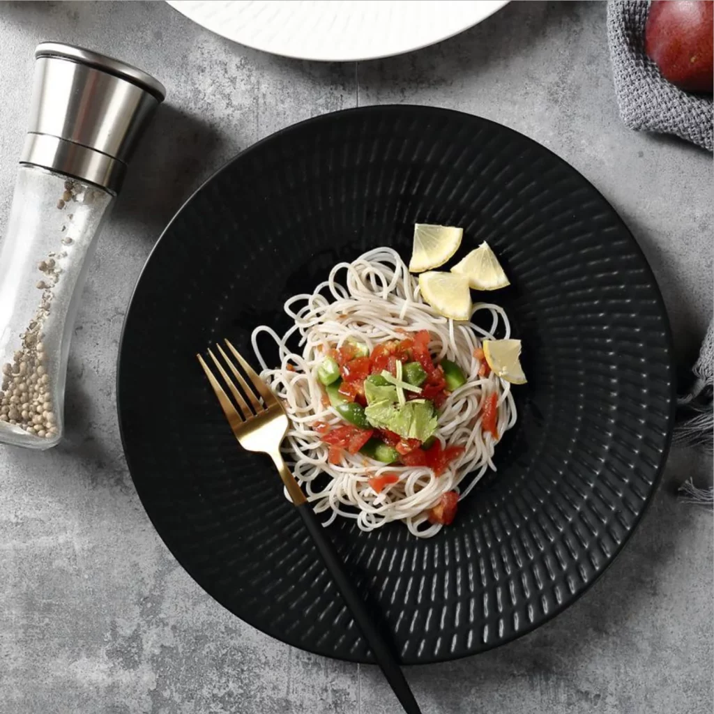
How Dark Plates Change The Dining Experience
Black, charcoal and deep-toned plates bring drama and mood to the table. They create intimacy, reduce visual noise and make bright foods pop with theatrical intensity. However, they also temper expectations. Desserts on dark plates are often perceived as less sweet, while savoury dishes feel richer and more serious. Restaurants use dark plates to slow diners down, encouraging focus and indulgence rather than speed. It’s not just style — it’s behavioural design.
Colour, Culture And Appetite
Plate colour perception is also shaped by cultural context. In many Asian cuisines, red and gold are associated with celebration and abundance, while in Western contexts, red can stimulate appetite but also signal indulgence. Blue plates are rare because blue foods are uncommon in nature, triggering subconscious caution. Green plates suggest freshness and health, making them popular in wellness-focused dining spaces. These associations influence not only how food tastes but whether we feel comfortable choosing it at all.
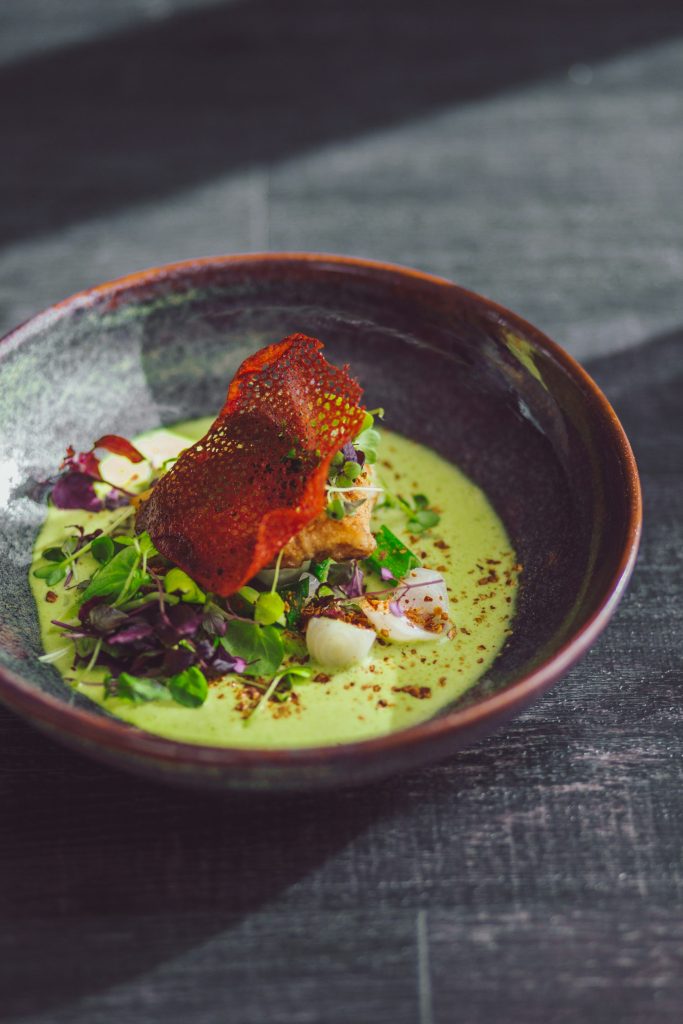
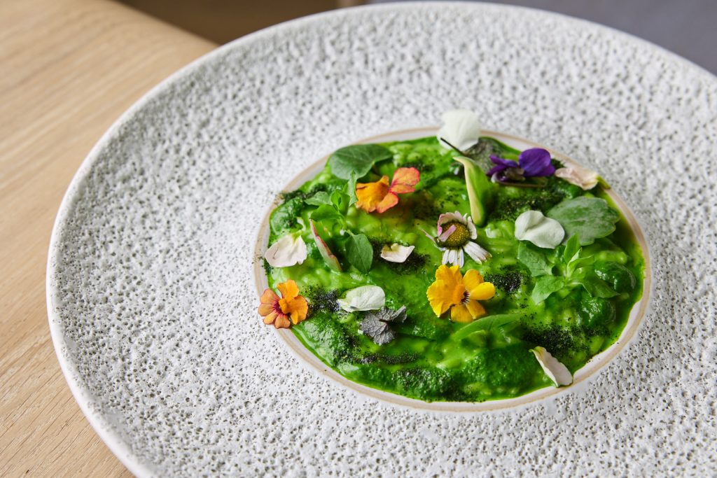
How Chefs And Restaurants Use Plate Colour Strategically
Chefs and restaurateurs choose plate colours as deliberately as ingredients. Fast-food chains favour high-contrast colours that stimulate appetite and speed eating. Fine dining establishments opt for muted tones that frame the dish like art, encouraging contemplation. Even portion perception is affected — food appears more abundant on smaller, darker plates and more refined on expansive white ones. Plate colour becomes an unspoken collaborator in the dining experience.
What Plate Colour Means For Home Dining
At home, plate colour influences portion control, indulgence and even satisfaction. Using high-contrast plates can help with mindful eating by making portions clearer, while softer tones create a relaxed, comforting atmosphere. Switching plate colours is one of the simplest ways to change how meals feel without altering recipes. It’s design psychology you can apply without a culinary degree.
Why Plate Colour Is A Silent Ingredient
Plate colour is the ingredient no one lists but everyone tastes. It shapes expectations, nudges decisions and quietly influences pleasure. In an age where dining is as much about experience as flavour, what sits beneath the food matters almost as much as what’s on it. Understanding plate colour isn’t about manipulation — it’s about awareness. Because once you see it, you can’t unsee it, and every meal becomes a little more intentional.