German Car Logos Explained: Hidden Meanings Behind Iconic Auto Brands
Some logos are not merely badges on a bonnet, they are declarations of ambition, engineering, and identity forged over decades of precision and pride
Cars, much like people, introduce themselves long before they say a word. Sometimes it is the sound of an exhaust, sometimes the shape of a grille, and sometimes it is simply a badge sitting proudly on the bonnet. Those little emblems are not just bits of chrome designed to look expensive in a parking lot outside a five star hotel. They are history lessons in miniature, carrying wars, engineering revolutions, family legacies, and national pride in a few carefully drawn lines. German car logos, in particular, are wonderfully serious about this sort of thing because Germans do not do meaningless decoration. If there is a horse, a star, or a set of rings on the front of a car, there is usually a story behind it involving industry, speed, precision, and occasionally a bit of glorious ego. From the four rings of Audi to the prancing horse of Porsche, these badges have become symbols recognised faster than some national flags. And once the meaning behind them is understood, every drive feels just a little more theatrical.
Audi
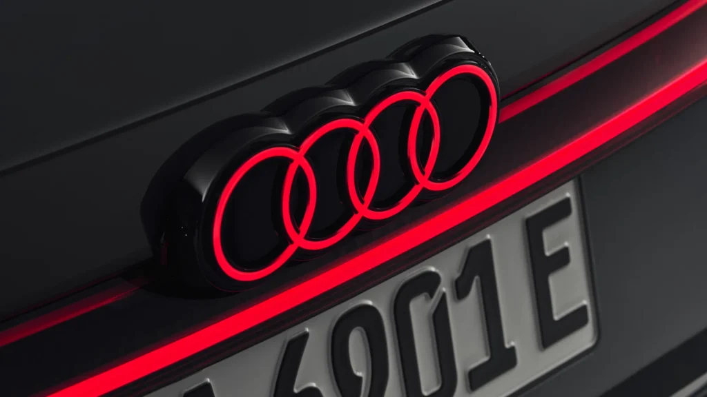
The four rings of Audi are perhaps the most elegant example of corporate history turned into visual identity. At first glance, they look simple, almost too simple, but those circles represent one of the most significant mergers in German automotive history. In 1932, Audi joined forces with Horch, DKW, and Wanderer to create Auto Union, and each ring symbolised one of those four companies. It was not a design exercise for style points; it was a declaration of survival and strength during difficult economic times. Today, those rings still sit proudly on the grille, carrying the same message of unity, precision, and engineering seriousness. Audi may now be associated with sharp LED lights and quietly intimidating executive saloons, but its logo still whispers the story of four brands deciding they were stronger together.
Also Read: Higher RPM Driving: Myths, Benefits, And What You Need To Know
Mercedes-Benz
![]()
Mercedes-Benz, naturally, could not settle for something modest. The three pointed star was created to represent the company’s ambition to dominate transportation on land, at sea, and in the air. It sounds outrageously ambitious because it was. Gottlieb Daimler had marked a star on a postcard sent to his wife, predicting that one day it would shine over his factories. That sketch eventually became the emblem of one of the world’s most powerful luxury carmakers. The star, enclosed in a circle, is not merely a badge; it is a statement of intent. It says this machine is engineered to lead, not follow. Whether it is attached to an S Class gliding silently down the autobahn or a Formula One car tearing apart a circuit, the symbol carries the same unshakable confidence.
BMW

BMW’s roundel is surrounded by one of the most persistent myths in motoring history. Many believe it represents an aircraft propeller cutting through the sky, a nod to the company’s aviation roots. It is a lovely story, dramatic and cinematic, but not entirely accurate. The blue and white sections actually come from the Bavarian flag, reflecting the company’s origins in Bavaria. Of course, BMW did build aircraft engines, so the aviation association was happily embraced later, and the myth became part of the legend. That is rather fitting, because BMW has always balanced engineering precision with emotional storytelling. The logo captures both: regional pride wrapped in performance ambition, with just enough mythology to make it unforgettable.
Also Read: The Story Behind Ferrari’s Prancing Horse Logo: History, Meaning And Legacy Explained
Porsche
Porsche’s crest looks like something that should be hanging above a castle entrance rather than sitting on the nose of a sports car, and that is exactly why it works. At its centre is the black prancing horse taken from the coat of arms of Stuttgart, the city where Porsche was founded. Surrounding it are the red and black stripes and antlers of Württemberg, the former German state. It is a badge drenched in heritage, combining local identity with aristocratic drama. Every time it appears on the bonnet of a 911, it reminds the world that this is not merely a fast car; it is a machine built with history stitched into every panel. The logo feels prestigious because it genuinely is, rooted in place rather than invented for marketing.
Volkswagen
![]()
And then there is Volkswagen, which takes the opposite approach entirely. No horses, no stars, no family crests, just a V sitting neatly above a W. It stands for Volkswagen, literally translating to people’s car. There is something wonderfully direct about that. Created in the 1930s with the idea of making practical motoring accessible to ordinary families, the badge reflects that purpose without unnecessary theatre. Over time, the simple initials became one of the most recognised symbols in the world, appearing on everything from humble hatchbacks to executive SUVs. It proves that sometimes the strongest branding does not need mythology at all. Sometimes clarity is enough. In true German fashion, it says exactly what it means and leaves the drama to everyone else.